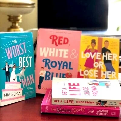
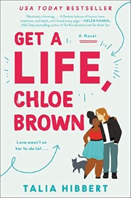
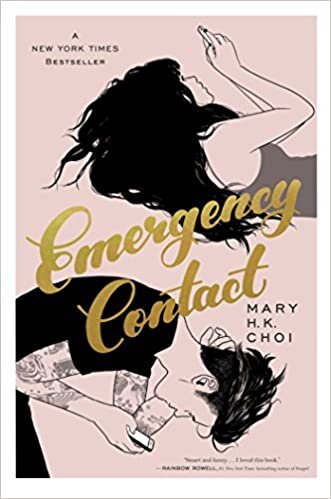
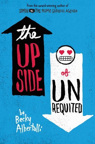
Isabeau and I talk about our problems with cartoon covers often. But as one negative iTunes review pointed out, we have barely scratched the surface of all the ucky feelings this kind of cover can inspire in us.
Not to get all Medium article about it, but I wanted to lay out my personal thoughts and feelings regarding this very specific thing (in this case, cartoon covers) that speaks to (I think) the larger BAD thing of genre erasure and femme subjugation.
I understand things change. More than that, romance is responsive and reflective of the moment of its publication. The overwhelming and sudden popularity of this re-thinking of the key signifier of our genre— THE COVER — bears interrogating.
A note before we go, this is not about critiquing the content of the books themselves. We are merely judging covers here.
Let’s boogie.
Reason 1
Cartoon covers don't communicate heat
Romance novel covers are a language. One of the key things they communicate is heat--or how sexually explicit a text is. For example, here is the cover art for a sweet romance, Morning Comes Softly by Debbie Macomber:
You can listen to our ep on this book here
And here is the original cover for the very steamy, The Magic of You by Johanna Lindsey, also published in 1993:
We did a whole series on the v. steamy JL.
Super easy to determine which fades to black and which slaps the back.
Now, try to figure out which of these is steamy and which is sweet:
If you guessed The Tourist Attraction is the Macomber, you are correct! Highly recommend buying a lotto ticket if you got that right (unless you already read these) because reading these covers isn’t the educated guess it used to be.
Reason two
Cartoon covers are the Watermelon Vapes of covers
Look at this collection of YA Romance covers.
If anything, these look like they could be steamier than say, The Right Swipe by Alisha Rai. But that wouldn’t be the case.
Not to be sex-negative (more on that later) but I’m not sure an adolescent reader would feel good reading about the physical intricacies of sex, or the consent-icracies of dirty talk. There is a lot of stuff that goes on in the fantasy of adult romance, especially steamy adult romance, that requires a nuanced understanding that comes with life experience. Sex and young people is precarious stuff.
Additionally, why would a grown person be more comfortable reading a book that looks like it was written for teens than a romance novel?
Let’s get into it.
Reason three
Sex-Negativity
Here is where the rubber really starts to hit the road for me. The romance genre’s consistent claim to subversity is that it has centered female sexuality since Kathleen Woodiwiss published The Flame and The Flower. It reflected the interiority of womens’ sexuality and its many shades--desirous, experimental, curious, voracious, apprehensive--before any other media knew that mattered. It then became an early space for queer sexuality and romance to take a place of privilege in a text. With the advent of self-publishing, stories about the ownership of sexuality and love and personhood for a whole range of subjugated identities and preferences has become more accessible through romance. Sex and love is imbued in each character. Through this move, the capital of being a person capable and worthy of love, being a desirable and desirous person, is granted to each character and the identities they hold.
So why neuter these characters in the most forward-facing aspect of the text?
One of these top selling covers displays affection, and it is a chaste nuzzle on the forehead. | Photo by Isabeau Dasho
Why hide sexuality, affection and desire? Why deny it? Why play coy? None of these questions are rhetorical. And the answer often leads me to point number 4.
Reason four
Romance-Negativity
One of the resounding beats in the cartoon cover parade is that it “attracts new readers”, “makes romance accessible to new readers.” How does it do this? Self-negation.
Romance criticism often revolves around this idea of quality. The Industry, the Catholic Church, The New York Times, and feminist publishing have all sniffed at the genre for a long time. So have plenty of writers. Romance has been and is still dismissed as shallow, poorly written, or just ignored completely. Therefore, the genre is considered unworthy of criticism. If they are unworthy of interrogation because they are simplistic and superficial, then reading them is a waste of time and mental capacity.
Fuck that. Reading for pleasure is the only kind of recreational reading that exists. Because we are people who make choices in our own self-interest, choosing a romance or choosing a different kind of book is done in self-interest. Whether to relax, to escape, to gain new perspective and understanding, or to fit in at book club. Placing a value on any of these choices denies the breadth of human experience. At any given moment, any person may need any of those things from a book.
That rant is to point out why romance shaming is wrong. Cartoon covers can be understood as an erasure of the genre, a form of shaming not so different from the way major news organizations did not review romance. Or the fact that “good” bookstores don’t stock them at all. By changing the look of a romance novel cover completely, the books status as romance is effectively hidden and denied.
Reason five
They are regressive, not progressive, design
I can appreciate cartoon covers, aesthetically. I’m only human after all. Cartoon covers are designed to be broadly appealing, a baby could appreciate these covers aesthetically. Bright colors! Geometric shapes! And then also, on a deeper level, faces but not racialized! Not distinctly beautiful in the way we’ve been socialized to understand as beautiful and use as a yardstick against which to find ourselves short!
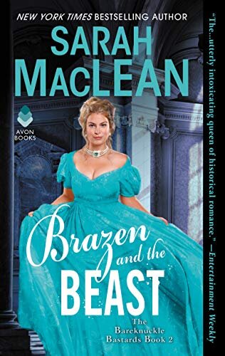
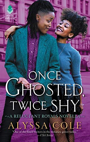
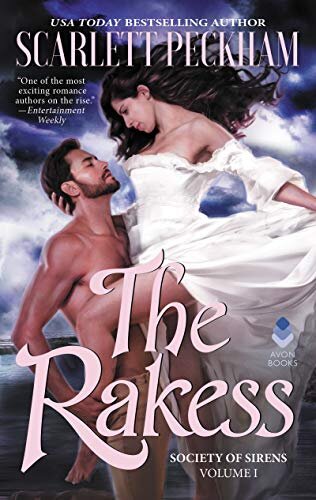
Traditional covers have proven they can do more for progressive inclusivity than cartoon covers can. Popular example (for a reason, I mean seek out that stepback), Brazen and the Beast by Sarah MacLean, which featured a model with a fuller figure than the classic cover heroine. The cover of Alyssa Cole’s Once Ghosted Twice Shy is speaking clearly to the characters inside--an androgynous model, natural hair, being flirty, lots of eye contact and casual embracing. Or how about The Rakess by Scarlett Peckham? A model with strong, athletic features, and a serious facial expression that speaks to complex feelings for the hero.
Maybe you never connected with these kinds of covers, even with all of the little cues they send about the content and love people deserve. Perhaps you feel nervous reading romance in public (that is valid, you’ve been socialized to expect people to judge you, even when they’re busy on their own commute or day at the park). If you want something new and fresh for romance, why can’t it just be new and fresh for design as a whole? Romance is a genre that pushes boundaries. The full package should convey that.
I would argue, then, that we should create a new language of cover art instead of duplicating what was already successful in Chick Lit. Not to keep crying about it, but why can’t romance have nice things just for it?
Reason six
Cartoon covers are a bare-assed, capitalistic grab for our dollars
Cartoon covers cost less money. A graphic designer can typically create the concept start to finish. That cuts out models, costuming (although publishers seem happy to skimp on that as well), and photographers.
On O Magazine's list of 38 Romance Novels to look forward to in 2020, 24 had illustrated/cartoon covers. Check out the mast graphic:
Look, everybody has to eat. I get that people need to make money, that we are all trapped on this capitalism hamster wheel. And perhaps this fact, because it is true for all of us, makes it the least offensive. But it also makes it the most insidious.
Ignoring the preferences of devoted readers, of authors who dreamed of their clinch cover moment, speaks to the true goals of publishing. And can help us uncover what is really centered in the choice to go cartoon. The question of disinvesting in the most profitable sector of publishing is unique to Romance. I mean, look at all of the Dune re-releases—where is my beautiful hardback, footnoted edition of Indigo?
And that question makes me cognizant of another facet of this issue. Basic business practices tell us it is far more profitable to maintain a customer than acquire a new one. It does not make sense to change the formula, potentially alienating a very loyal, dependable consumer base. Publishers are obviously prioritizing new readers.
Maybe it is because in spite of all the ink that has been spilled describing how key romance readership is to publishing success, the years and years that fact has been proven out, publishers still see this side of their business as evergreen as it is disposable. Cover art is a way that publishers conscientiously communicate the value they perceive a publication to have. Less money spent on covers can be understood to convey less value on the text.
Cartoon covers feel like another way to subjugate romance readership. These covers are a tool to exploit reader-shame in order to further denigrate and deny the genre’s relevance and importance--both economically and culturally. And I think romance deserves better.

